


So, the last post I made was about my art getting destroyed by mold and water damage.
Thankfully, I was able to get good photos of the art, and get those photos slapped into my computer.
I was able to salvage about 1/3 of the originals that were damaged- unfortunate that it was that few of them, but in the grand scheme of things this one folio case was only about 1/10 of the art I have stored. The rest is smaller format, and in actual waterproof cases. So while the sentimental loss was fairly large due to which pieces were lost, the actual loss wasn’t THAT big.
Of the pieces I lost, was able to photograph around 150 artworks to retain a digital copy of them. That’s only about half of the ones I lost, but MOST of the other half were thankfully pieces I didn’t realy mind not getting photos of because they were either college sketches or ancient works that were never going to see the light of day anyway. Almost all of the important pieces I DID at least get a digital copy of, and they only require a little bit of digital cleaning to remove some flecks of mold or to remove the water stains from them.
I would be a LOT more emotionally devastated if the rest of my art cases had also been infiltrated by water but I’ve checked and it really was only this one.
All in all, it took me about two days to get the damaged art sorted, photographed and trashed.
After that, the last couple weeks have predominantly been spent working on art and planning some personal stuff.
In much happier art news, and what I actually came here to talk about- as of today I have two new prints that just went live!
This artwork took the brunt of July for me to complete.
Commissioned by Delsin Monroe to advertise their upcoming magic show at Wilmington Goth Fest 2025 hosted by the Eagle’s Dare, I took it upon myself to make the artwork be a direct challenge to myself, and the result is this beautiful artwork.
The prints have been released as the Standard version, which is the tarot card arrangement on the left below, and the Limited Edition magic show variant on the right.
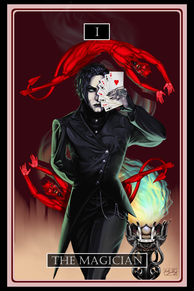

The standard version will remain in my shop from now on, but the limited/poster variant will be discontinued after 100 prints have been sold.
The Challenge:
So what was the challenge I gave myself with this piece?
Well, when Delsin requested the commission he stated he wanted the work to look like one of the vintage victorian era magic show posters- these are artworks that I am a huge fan of and I never thought I’d actually get the opportunity to work in the style, and I couldn’t really think of a reason to give myself to do any art like that, either.
So when Delsin’s request came in, I realized it was the perfect opportunity to throw myself into an artwork and pull out all the stops. I went into the artwork with the intent to take everything I’ve done in the last five years and compile the best techniques, and the best attention to detail to make this piece be the epitome of my current skills as an artist.
But when I say it was a Challenge to myself, what I mean by that is that I was actively doing what I said above and competing with prior artworks I had done to actively make an artwork that would supplant those prior works in my mind.
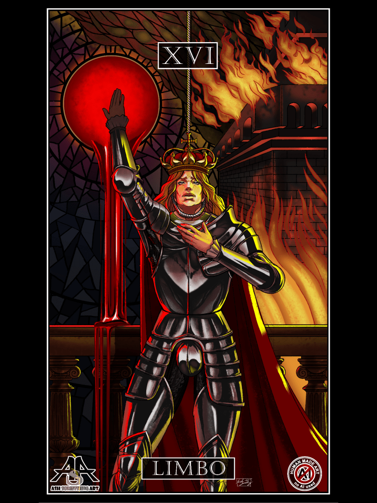
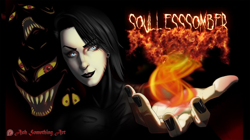
These are the works I was competing with:
It may not entirely be clear at first glance how I had challenged myself against these artworks, although I may be wrong.
For starters, I do’t have any complaints or negative critiques of Major Arcana XVI Limbo, and especially the background was something that I’ve always loved. This piece has been one of my favorite artworks of my own for the last 5 years, since I completed it.
It has a bold and interesting background which has a lot of details, the colors and mood are fantastic- it is exactly what I wanted to create when I created it.
Almost.
At the time of creation, I actually didn’t have a good handle on metallic reflections, and the harsh yellow and red light on the armor were more of an afterthough than actual planning, and because of this the direction of those lights and the parts of the armor that they hit are completely unrealistic- and while that’s fine for art, it was something I wanted to give myself an opportunity evenually to do better- not by editing Limbo itself but by learning how best to do those kinds of reflections and the details in armor to make it feel more realistic.
As a viewer who isn’t versed in creating at one may look at this piece and not see anything wrong with the armor- and for a long time I was the same way. It looks GOOD. But the longer I have looked at it over the last four years, the more small details about it stand out as incorrect bits- light wrapping to the front where it shouldn’t, no reflections of colors that come from places OTHER than the light (the bannister, his cape, his hair) and the yellow and red rim light are the same intensity from top to bottom.
These are all things that would be easy to fix about the artwork, but I preferred leaving this details as they were to stand as a reminder of things to pay attention to in future artworks.
The second artwork I was challenging is the first piece that Delsin ever commissioned from me, featuring a portrait of himself that he wanted to use as a Twith overlay. The original work is animated, and I feel like it’s for that reason that I have the problems with this work that I do- I feel like I had to cut corners on the art to be able to give myself time to animate it.
But in general, it just doesn’t meet my quality standards.
I have been able to draw realism in pencil and charcoal, and paint realism, since I was in highschool. The intent behind this work was to make a realism portrait of Delsin digitally, then animate the flame in his palm over it.
However what I see when I look at this piece is rushed shading with soft edges and no variation. I see colors that mix and neutralize themselves instead of providing start contrast, line art that feels separate from the shading and doesn’t blend well enough, and clashing details that are a mix of cartoonish/comic book, and realism.
Going into The Magician, I had both of these artworks up to reference and do battle with.
The intent was to make a TRULY realistic portrait, which took inspiration from the late 100s oil paintings that were used in those old vintage posters, and to build off of that into an image that brought a feeing of realsm from top to bottom.
I challenged myself against the metal of Limbo by creating the brazier and going into miniscule detail to make it look chrome/silver and show reflections of everything around it, bringing the reds and tans of the background and the yellows, greens and blues of the flames into it- to show the metal details reflecting parts of the metal form off of them.
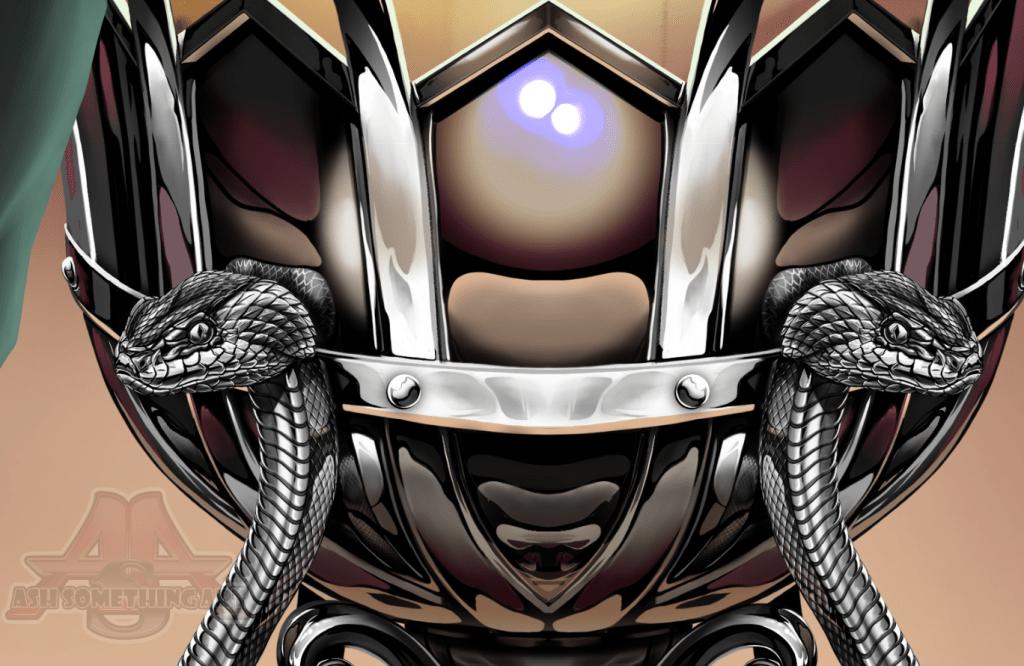
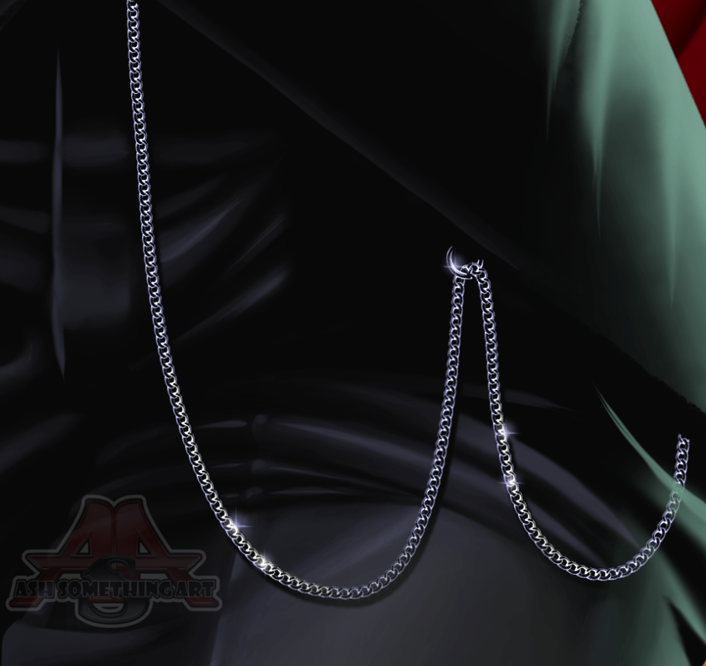

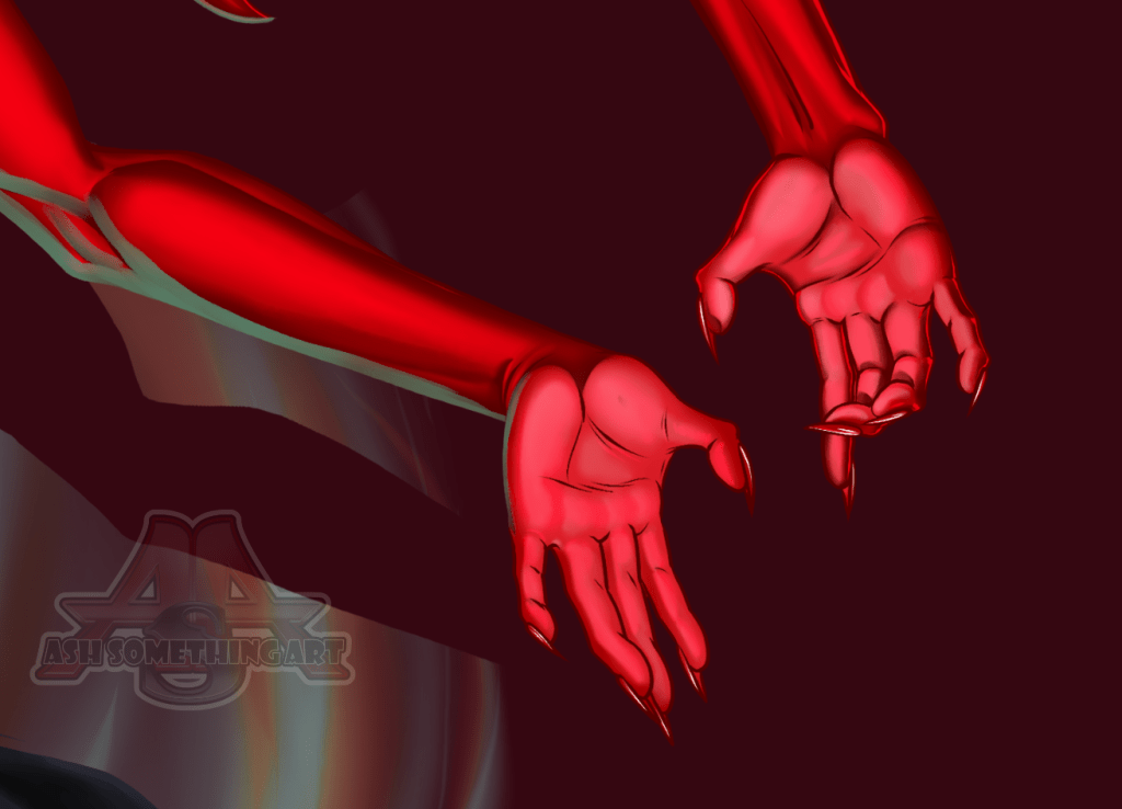
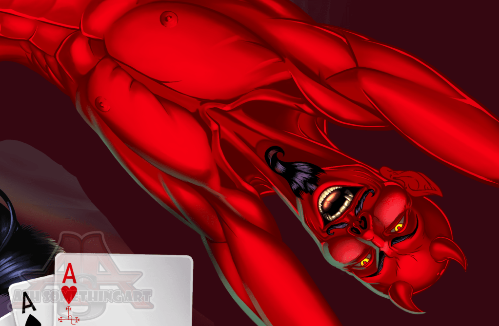
I took great pains to ensure that even the smallest details, from the pocket chain on his hip, to the scales of the metallic snakes, to the tattoo on Delsin’s hand, the reflections in the metal, the fire and the smoke rising from it, the details on the demons, all looked believably realistic no matter which part of the artwork you were looking at or how closely you were looking, so that zoomed in or out what you see is
This process took a lot of time, with things like Delsin’s hand alone taking around 6-8 hrs to detail, and the snakes taking around 10 hours on their own. The end result is an artwork I can be truly happy with as I feel that I have properly beaten the challenge I laid out for myself, and the artwork I have as a result is a piece that I’ll be proud to include in my portfolio for years to come.
And moving forward from this piece, I now have a new grasp on my abilities and a much clearer understanding of my current limitations. I hope that I’m able to do some equally challenging work in the near future so that this can become the quality of art you can all expect of Ash Something Art going forward.

Leave a comment